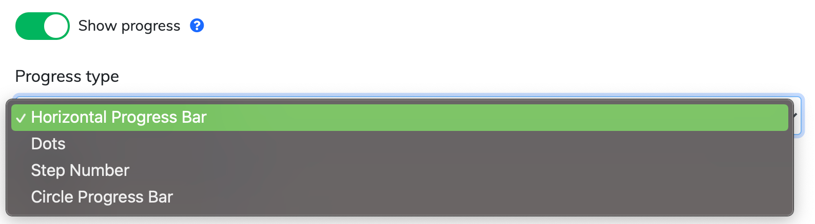
You can now choose from four different styles to show users their progress during a tour or a survey. These indicators help set expectations and improve tour/survey completion rates.
Available Indicator Styles
In addition to the original Horizontal Progress Bar, you can now select:
Dots: A minimalist series of points representing each step.
Step Number: Displays the current position numerically (e.g., "Step 2 of 5").
Circular: A compact radial graphic that fills as the user advances.
How to Enable
The progress style setting is located in the Tour/Survey Settings panel.
Note: These options only appear when the "Show progress" toggle is enabled.
Adaptive Positioning
The progress indicator will automatically adjust its position based on your Button Alignment settings to ensure it doesn't overlap with your navigation buttons.
Choosing the Right Progress Style
| Style | Best For... | User Experience |
| Horizontal Bar | Long tours (7+ steps) | Provides a clear sense of overall "completion" at a glance. |
| Dots | Short, punchy tours (3–5 steps) | Offers a modern, app-like feel without cluttering the UI. |
| Step Number | Training or complex workflows | Best for clarity; users know exactly how many tasks remain. |
| Circular | Compact or "Spotlight" tours | Great for saving space in small modals or tooltips. |
Pro-Tip
If your tour is longer than 10 steps, we recommend the Step Number or Horizontal Bar. For very long tours, dots can become difficult for users to track visually!
Need a hand? If you have questions about styling your tours, please contact our support team.