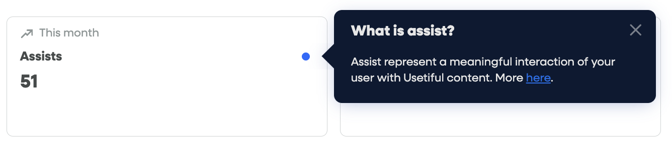
A Hotspot Beacon is a visual cue (like a pulsating dot) that draws a user's attention to specific elements on your page. When a user interacts with the beacon, a Smart Tip appears to provide more information.
Available Beacon Styles
You can choose from three different visual styles for your hotspots:
Pulsating Dot: A classic, eye-catching animation.
Question Mark: Best for "Help" or "FAQ" contexts.
Info Icon: Ideal for providing additional context or tooltips.
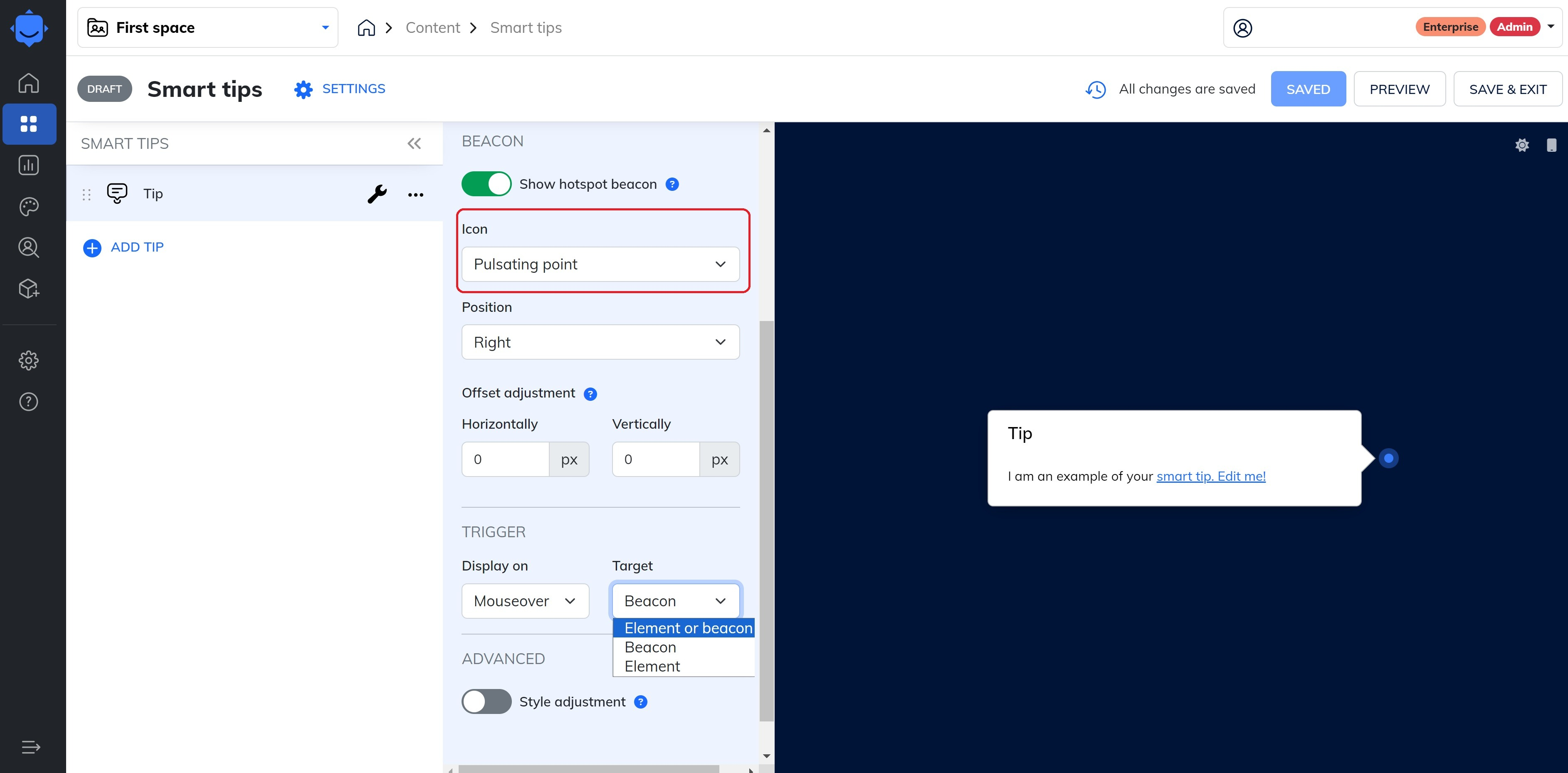
Where to find it: In your Smart Tip settings, look for the Icon dropdown. This option only appears when the beacon is enabled.
Trigger & Alignment Settings
1. Trigger Options
In the Trigger section, you can decide exactly what activates the Smart Tip:
Element: The tip appears when the user hovers or clicks the UI element itself.
Beacon: The tip appears only when the user interacts with the hotspot icon.
Combined: The tip appears when interacting with either the element or the beacon.
2. Alignment
You can choose to align the tooltip bubble to either the Element or the Beacon.
Align to Beacon: The tooltip will appear directly next to your chosen icon (dot, question mark, or info icon), ensuring the tip is visually connected to the hotspot.
Customizing Beacon Appearance
If you want to change the color or size of the beacon beyond the default settings, you can use Custom CSS within your theme.
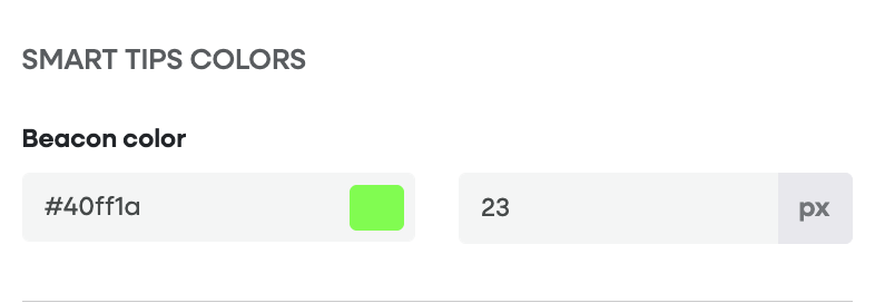
Go to the Themes section and select the tab "Smart Tips"
On the left-side menu, you will find the beacon colour and size configuration field.
If your application theme is overriding Usetiful's Themes, paste the relevant code in the Custom CSS:
To change the color:
.#{$classNamePrefix}-beacon {
  background-color: #888888; /* Replace with your hex code */
}
To change the size:
.#{$classNamePrefix}-beacon {
  width: 15px !important;
  height: 15px !important;
}
Save the theme and apply it to your Smart Tips Group to see the changes live.
Need more help? If you run into any issues with CSS or beacon placement, feel free to contact our support team.