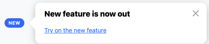
Want to draw your users' attention to a freshly released feature? You can easily customize the standard Usetiful Smart Tips beacon to display a distinct "NEW" pill badge using a little bit of custom CSS. Follow this step-by-step guide to set it up.
Step 1: Add the Custom CSS to Your Theme
To change the appearance of the beacon from a simple icon to a text badge, you will need to add a custom style to your active theme.
Go to your Usetiful portal and navigate to Themes.
Select and edit the theme that was applied to your Smart Tip.
Paste the following CSS code into your theme's custom CSS section:
.#{$classNamePrefix}-beacon__iconic {
    min-width: 46px;
    height: 22px;
    padding: 0 10px;
    border-radius: 999px;
}

.#{$classNamePrefix}-beacon__iconic:after {
    justify-content: center;
    height: 100%;
    font-size: 11px;
    font-weight: 700;
    letter-spacing: 0.3px;
}

.#{$classNamePrefix}-beacon__iconic-question:after {
    content: "NEW";
}
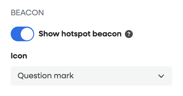
Step 2: Choose the Question Mark Icon
The CSS snippet above specifically targets and replaces the Question Mark beacon icon.
Open the specific Smart Tip you want to customize.
In the settings, look for the beacon icon selection.
Choose the Question Mark (?) icon.
? How it works: The CSS code overrides this specific icon, turning the question mark into a styled pill shape and injecting the word "NEW" inside it.
Important: Previewing Your Changes
Ignore the Editor Preview: If the badge looks distorted, misaligned, or disoriented inside the Usetiful editor layout, don't worry! This is a known limitation of the internal preview window.
Test via the Plugin: To see how the badge actually looks, use the Usetiful browser extension/plugin to preview the Smart Tip directly on your live site or staging environment.
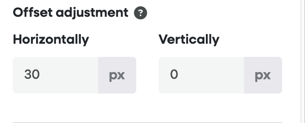
Fine-Tuning: If the badge overlaps your text or UI elements slightly, use the offset adjustment settings within the Smart Tip editor to nudge it into the perfect position.